
Flutter/Dart, iOS, shipped solo
Live on the App Store. Every screen decision had to hold up in a real build, not a prototype.
UX case study · Rare Reins
Rare Reins is a live, shipped iOS app. This page isn't another feature tour of it — it's an honest account of the interface decisions behind it, written for people evaluating design thinking, not download numbers.
How this was actually made:Rare Reins was designed directly in code — there was no separate wireframe or sketch phase, so there's no research paper trail to pull quotes from. What follows is reconstructed honestly from the shipped app and the reasoning behind it, not a retrofit of a process that didn't happen. No personas, review counts, or download figures appear below that weren't actually gathered.
Problem & audience
Rare Reins is built for horse lovers who like mixing and matching traits and get real enjoyment out of not knowing exactly what they'll get — the appeal is chasing a lucky outcome. That's a specific design problem, not just a theme: the product has to make randomness feel exciting and fair rather than opaque or arbitrary, and it has to do that while real purchases (stable expansion, boosts) sit right next to that randomness. Nothing about the interface can undermine the trust that makes the luck feel worth chasing.
What the interface had to work within
These aren't feature bullets — they're the ground the design decisions below had to stand on.
Live on the App Store. Every screen decision had to hold up in a real build, not a prototype.
22 tables, 33 row-level-security policies, 13 Postgres RPCs. Every breeding action is a real, permissioned database write — not a client-side illusion.
Email/password auth with verification, plus server-side Apple in-app-purchase receipt verification. The randomness in breeding sits next to actual purchases, which raises the bar on trust.
Unit-tested breeding and genetics logic. The hard UX problem was never the math — it was making that math legible to a player who isn't going to read a spec.
The hard part
Constraint → decision
Traits started as flat, single images you could mix and match — and it was limited almost immediately. A coat pattern and a mane style couldn't combine independently; the visual system couldn't keep up with the genetics. Rebuilding it as 2D layered asset compositing meant each trait — coat, markings, mane, tack — became its own layer that could combine with any other layer. That rework is what makes every other screen in this case study possible: without independently combinable layers, there's no lineage system, no dormant traits, no foal that visually reflects four generations of breeding.
Deliberate choice
Locked genetics exist the moment breeding starts — the game already knows what the foal will be before it's born. The foal card didn't always show a live preview. It was added so players had something worth looking at during the wait instead of a blank timer: a partial trait read (“slim frame, short mane, green eyes”) that hints at the outcome without giving it away. For an audience that's explicitly here for the thrill of a lucky outcome, the anticipation had to be part of the reward, not just friction before it.
Forced by the genetics, not a stylistic choice
Traits can go dormant — a grandparent can carry something neither parent visibly expresses, and it can resurface two generations later. A screen that only showed “mom and dad” would lie about where a foal's traits actually came from. That's what pushed the lineage screen into a tap-to-inspect ancestry chain instead of a flat two-parent summary: players can trace a trait back past the immediate parents to find out where it really came from.
Two signals, one market
The audience splits — some players breed for a specific look, others for the highest-value bloodline — but the market doesn't force a choice between them, because the two signals aren't actually opposed. Visual rarity is priced in directly: a long mane drives a horse's value up over a standard mane, the same way a strong hidden genetic line would. And because selling was never required to keep or breed a horse, a player who doesn't care about price at all can just build the stable they want to look at, untouched by the market. Value-chasers and looks-chasers are working inside the same system, just optimizing for different things in it.
Key screens
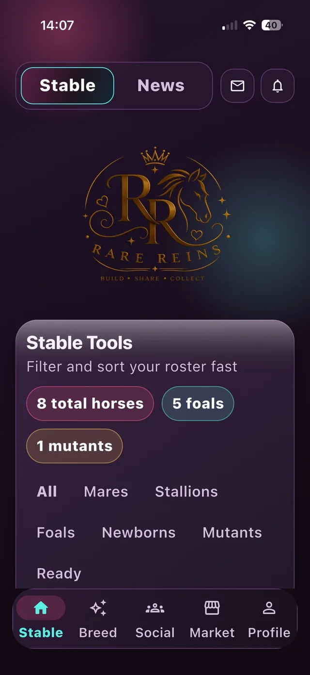
The roster view players return to constantly. Filters (mares, stallions, foals, newborns, mutants, ready) exist because a growing collection needs to be sortable fast, or the loop turns into scrolling fatigue instead of a stable you're proud of.
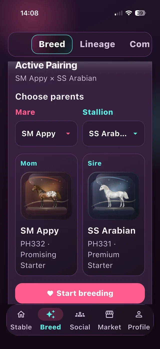
Picking a mare and stallion is the actual decision point of the game. Showing both horses side by side with their registry ID and tier, before committing, is what turns breeding from a random button-press into a considered choice.
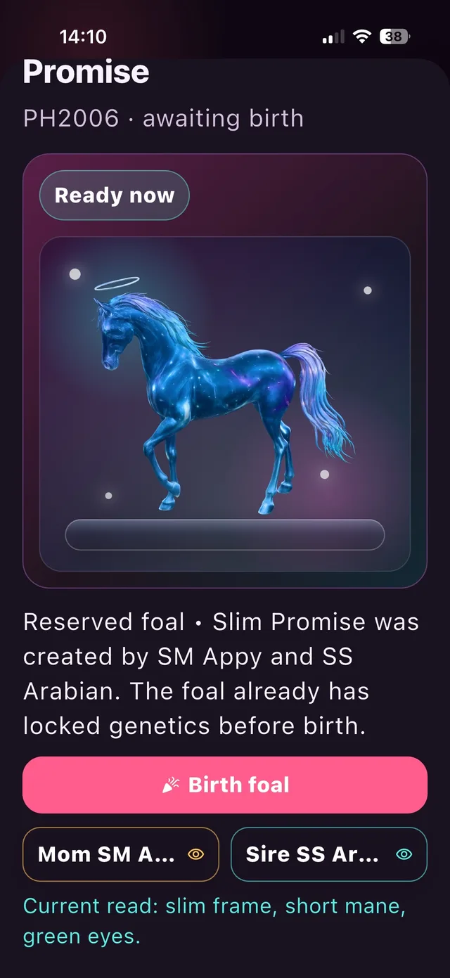
The deliberate anticipation screen. A glowing, not-yet-final silhouette plus a partial trait read gives players something to react to and speculate about before the reveal, instead of a static loading state.
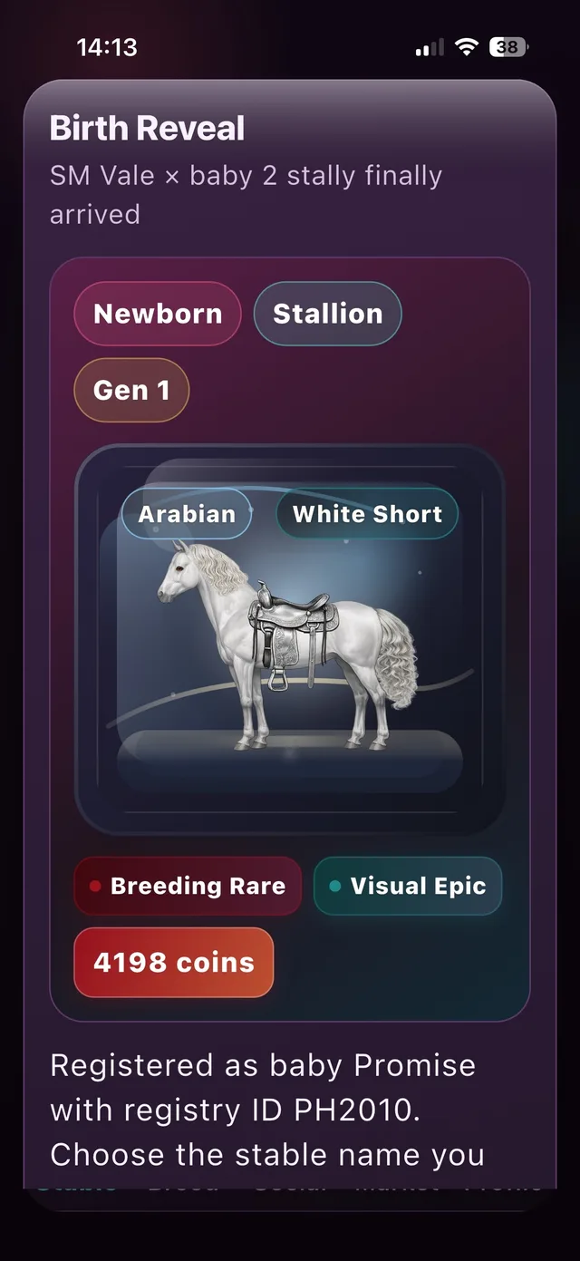
The full reveal: final traits, rarity tags, and value. This only works as a payoff because the anticipation screen came first — reveal without a wait is just a result; reveal after a wait is an outcome.
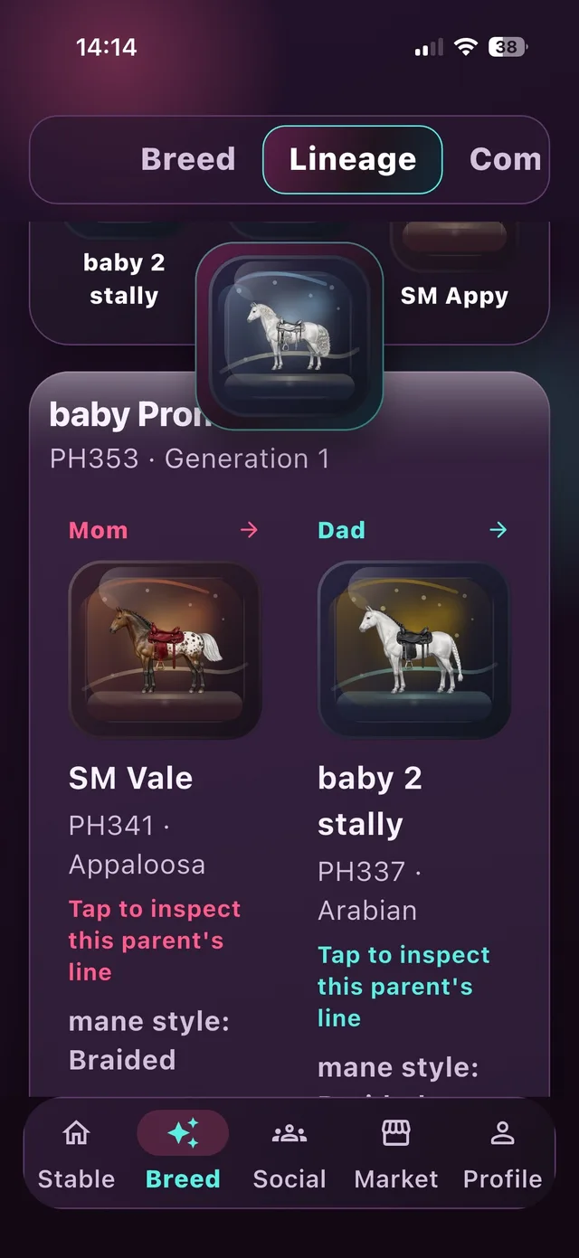
Built to answer “where did this trait actually come from,” including traits that skipped a generation. “Tap to inspect this parent's line” exists specifically because dormant traits made a flat two-parent view misleading.
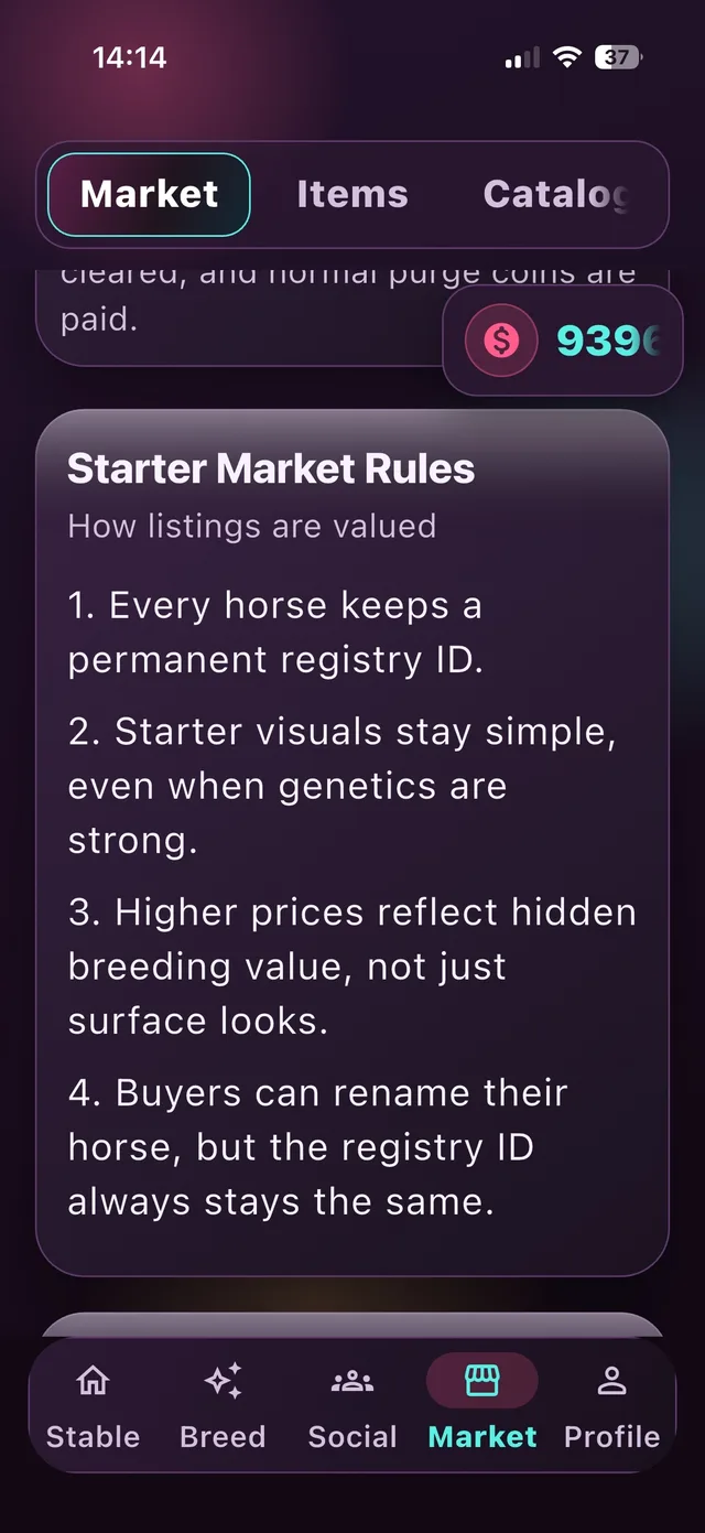
An attempt to make an invisible pricing model legible: registry IDs persist through resale, and higher prices are supposed to reflect hidden breeding value rather than surface looks. It's the most honest — and least finished — screen in the app.
Legibility & the closest thing to research
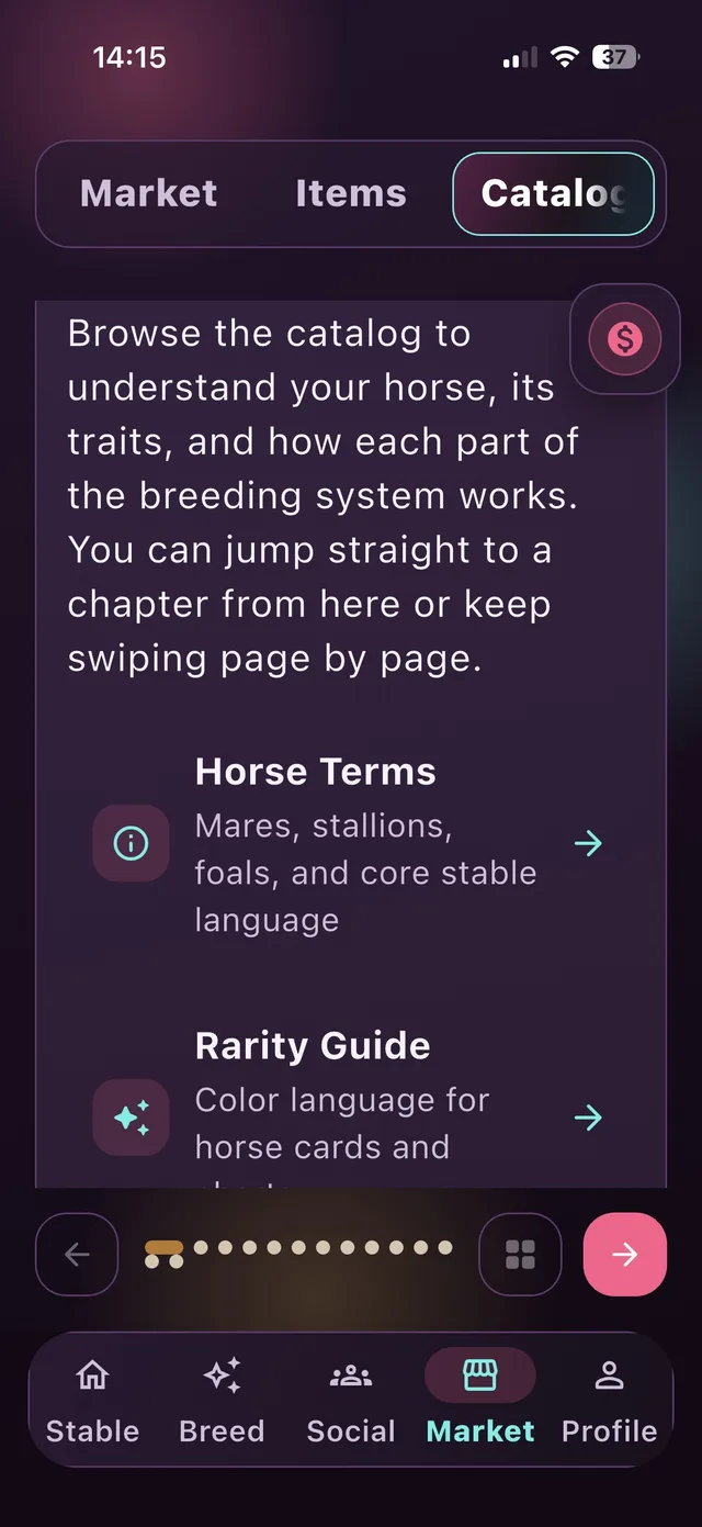
There was no budget for a formal onboarding study, so the genetics and rarity system needed to explain itself. The catalog is a self-serve glossary players can dip into instead of a tutorial they have to sit through.
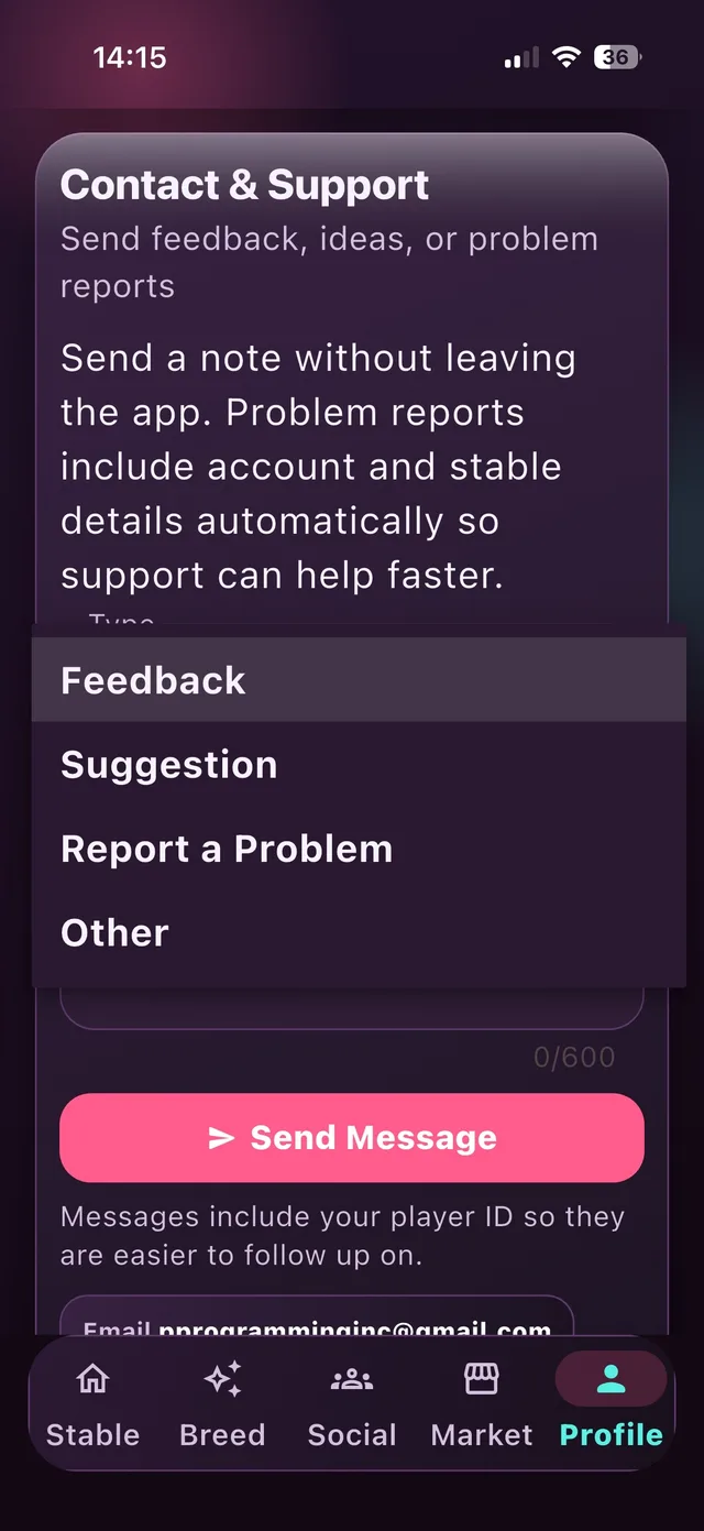
There's no dedicated research pipeline behind this app — this feedback form is genuinely the closest thing to a research channel it has. Messages carry the player's account and stable details automatically, so a report is actionable without a back-and-forth.
Outcome & what I'd do differently
Rare Reins is live on the App Store. There isn't a meaningful body of App Store reviews or download data to cite yet, and I'd rather say that plainly than manufacture a metric. What is confirmed is the mechanism: the market prices in visual rarity alongside hidden breeding value, and nothing requires a player to sell, so a value-focused stable and a looks-focused stable are both fully supported by the same system.
What I don't have is data proving players actually experience it that way. The mechanism working in theory isn't the same as evidence that value-chasers and looks-chasers both feel served by it in practice, and right now the only signal is whatever comes through the in-app support form. If I were doing this again, I'd build a lightweight way to actually measure that — even something as simple as a one-tap prompt after a breed or a sale — instead of relying on ad hoc messages to tell me if the assumption holds.